In the book Creative Selection (which I reviewed last year if you need a refresher), Ken Kocienda discusses his work on the iPhone and iPad touch keyboards, which were revolutionary at the time.
Kocienda created two versions of the keyboard for the iPad. One was a scaled-up version of the iPhone keyboard, with large keys. The other was a keyboard with more keys, similar to a MacBook keyboard. Kocienda created a zoom button that would allow users to switch between the keyboards, giving them the option for more keys or bigger keys. Kocienda and the team felt like this was a great use of the iPad’s larger screen. Users would have options based on their preferences, and could easily toggle between the keyboard of their choice.
When he eventually demoed the keyboards to Steve Jobs, Jobs characteristically examined them for several minutes and then told the group that they only needed one keyboard, right? And he asked which one would it be. Kocienda had been using both keyboards for several days, and he knew it should be the simpler keyboard with larger keys. Apparently that was the right answer, because the iPad shipped months later with that keyboard.
Keeping it Simple
Steve Jobs knew that keeping things simple was the key to a good user experience. We can add two keyboards to an iPad, but users don’t need two keyboards to type on.
It is easy to complicate our work. Many of the tools we use these days make it incredibly easy to add more and more with less and less effort.
Roadmaps
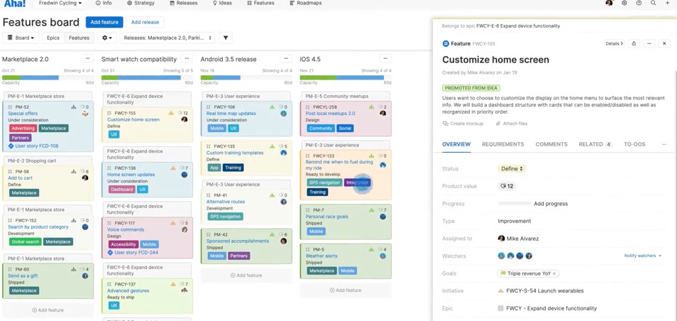
For example, in several companies I’ve used project/product software like below. One of my major issues with it (Aha specifically, but other tools like it) is that it is project management software that product teams adopt, and it never fits quite right. But aside from that, it is also packed with features that make it (relatively) easy to add more and more, from timelines to reporting to multiple layers of releases.
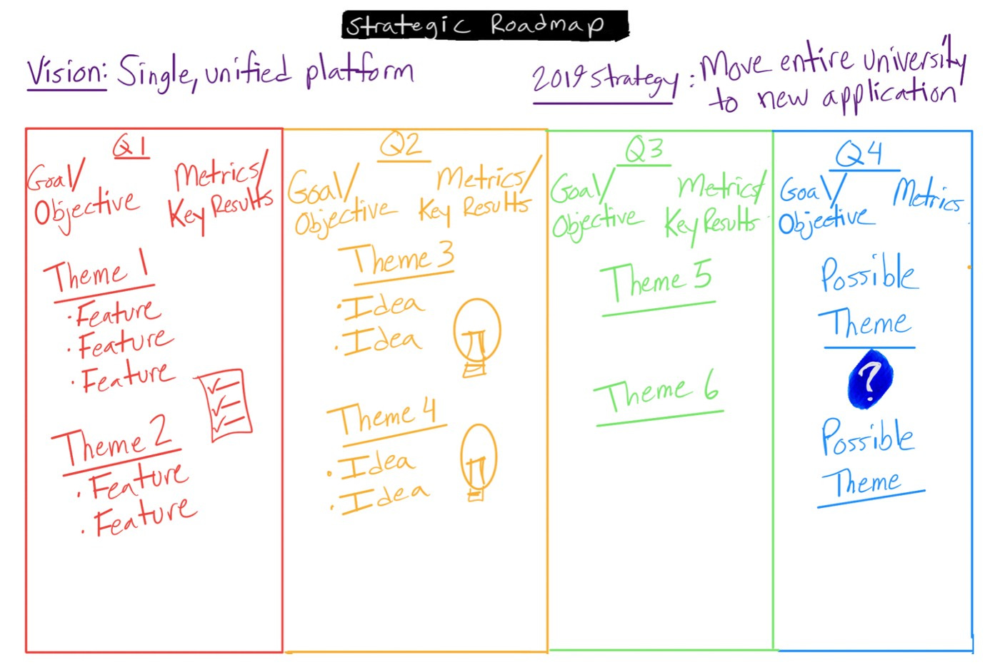
And with the ease of adding, we often add more and more, complicating our discovery and roadmaps. You can see an example of this here:
Roadmaps serve several purposes, which I wrote more about in an article several years ago called Product Roadmaps: Love, Hate, (and Hate).
The simpler we can keep our roadmaps, the closer they will align with the goals we should have for them—namely inspiring our teams, aligning everyone, and fostering discussion and communication.
Mockups
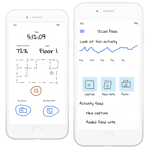
The same is true for the early phases of prototypes and mockups that we create. Figma, Sketch, and other tools have made it incredibly easy for us to create high fidelity designs quickly and easily.
Sometimes too quickly. When we’re able to move from idea to high fidelity design without the sketching and “ugly” phase, we miss some of the insight we can gain from the purpose behind the design.
Once we move to high fidelity design, even if we know better, it’s too easy to get caught up in the details and lose sight of the problems we’re solving. Much like the roadmap and feature board above.
This happened to me recently. As we were going through designs and ideas, we continually were moving into very beautiful, high fidelity designs. It was easy with our talented team and the tools we had. But not wanting to get caught up in the details, I stepped us back and made some really ugly sketches (which is what product managers do, and I do even more than most).
These helped reframe the conversation from “nearing completion” to “early stage”, which is exactly what I wanted.
So…
So what can we do? Next week I’ll be diving deeper into ideation and keeping our exploration and prototyping simpler to avoid some pitfalls above. If you haven’t subscribed, hit up the link below.


